
Tenant Administration
Tenant Administration is the central dashboard for managing your organization’s users, groups, extensions, dashboard layout, permissions, and what the AI assistant is allowed to reach. Administrators can provision users, manage group memberships, arrange the Home dashboard, and control which apps each group can see.
Accessing Tenant Administration
Section titled “Accessing Tenant Administration”Click the Apps button — the grid icon in the header, available on every page — and choose Tenant Administration. On the Home screen there is also a gear shortcut in the header that goes straight there. See Finding and Opening Your Apps if it is not listed.
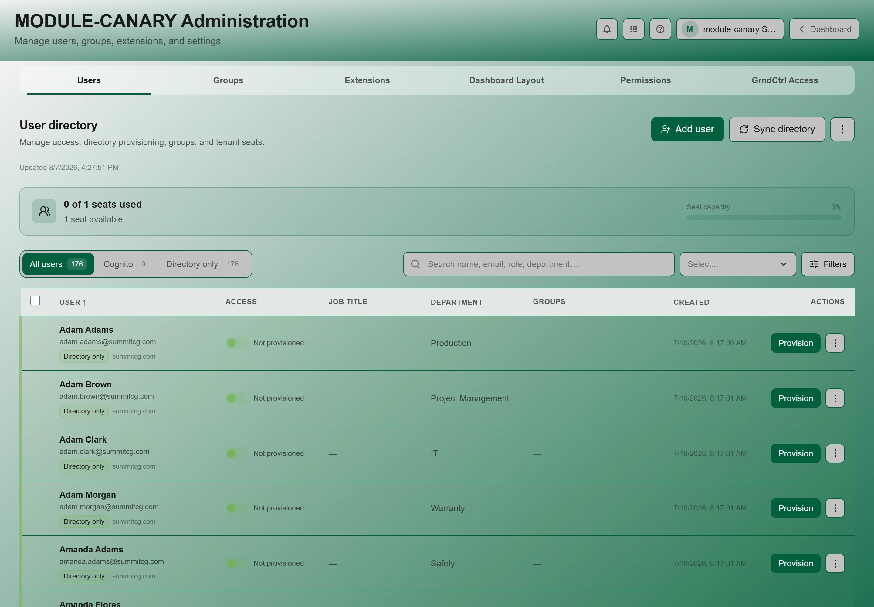
The page is organized into tabs: Users, Groups, Extensions, Dashboard Layout, Permissions, and GrndCtrl Access. Every tab is visible to anyone who can open the page — there is no per-tab gating.
Users Tab
Section titled “Users Tab”The Users tab is a single list of everyone in your organization. There is no separate pending-users section — a user who needs approval sits in the same list, flagged with a google_pending badge.
Adding and Refreshing Users
Section titled “Adding and Refreshing Users”Three controls sit above the list:
| Control | What it does |
|---|---|
| Add user | Opens the create-user form, for someone who is not in your company directory. |
| Sync directory | Pulls the current state of your company directory into GrndCtrl, bringing in new starters and picking up changed job titles, departments, and offices. It reads Syncing… while it runs. |
| Refresh directory data | In the More directory actions menu (the vertical ellipsis). Re-reads what GrndCtrl already holds, without going out to the directory. |
Users Awaiting Approval
Section titled “Users Awaiting Approval”When someone signs in with Google for the first time, their row appears with the google_pending badge until an administrator approves them. Look for the badge rather than for a section heading.
- Approve — grants the user access to the tenant
- Provision — creates a full user account with group assignments
- Dismiss — removes the pending request
- View — opens the user’s profile card
- Edit — modify user details
- Delete — permanently removes the user
The User Table
Section titled “The User Table”The table shows active, disabled, and pending users together, with these columns:
| Column | Description |
|---|---|
| User | Display name and email together. Sortable. |
| Access | The user’s access level, and the google_pending badge when they are awaiting approval. |
| Job title | From the directory record. Hidden on narrower screens — widen the window if you do not see it. |
| Department | From the directory record. Sortable. |
| Office | Office location from the directory record. Sortable. |
| Groups | Every group the user belongs to. |
| Created | When the account was created. Sortable. Note this is not a last-seen date — the table does not show sign-in activity. |
| Actions | View, Edit, Delete — plus Approve / Provision / Dismiss on a user awaiting approval. |
A checkbox column on the left selects users for bulk group changes, and the header checkbox selects everything currently visible after filtering. User, Department, Office, and Created are sortable; click a heading to sort by it.
Editing a User’s Groups
Section titled “Editing a User’s Groups”- Click Edit on any approved user.
- The Edit Groups modal opens showing all available groups as checkboxes.
- Check or uncheck groups to add or remove the user.
- Click Save Changes.
Groups Tab
Section titled “Groups Tab”Groups organize users for access control and content targeting.
Viewing Groups
Section titled “Viewing Groups”The Groups tab shows all groups with their member counts (e.g., “Managers (5 members)”). Click Refresh to reload the list.
Creating a Group
Section titled “Creating a Group”-
Click + Add Group.
-
In the Create New Group modal:
- Group Name — required.
- Description — optional.
-
Click Create Group.
Extensions Tab
Section titled “Extensions Tab”This is where you decide who can use each app your organization has turned on. Every extension is listed with its current access state, shown as either “Visible to N groups” or “Not visible (no groups assigned)”.
Configuring an Extension
Section titled “Configuring an Extension”Open an extension’s Configure dialog to set:
| Control | What it does |
|---|---|
| Enabled | Turns the extension on or off for your organization. |
| Show in App Drawer | Whether the app’s card appears in the App Drawer at all. Off means it is still enabled but only reachable by a direct link. |
| Open in App Drawer | Whether clicking the card opens the app inside the drawer, or navigates to its own full page. Independent of the toggle above. |
| Category | Where the app is grouped in the App Drawer — Communication, Business Management, Administration, or Integrations. |
| Visible to | The groups that can see and use the app. This is the access control. |
| Admin group | The group that gets the app’s own admin surface, where it has one. Tenant administrators and developer administrators always pass this check. |
You can also toggle extensions on and off directly from the list, including All ON and All OFF, and apply Open in App Drawer to every extension shown in one action.
Dashboard Layout Tab
Section titled “Dashboard Layout Tab”The Dashboard Layout tab lets you customize how cards appear on the Home screen for all users in your tenant. You can rearrange, resize, add, and remove cards, and organize them into collapsible folders.
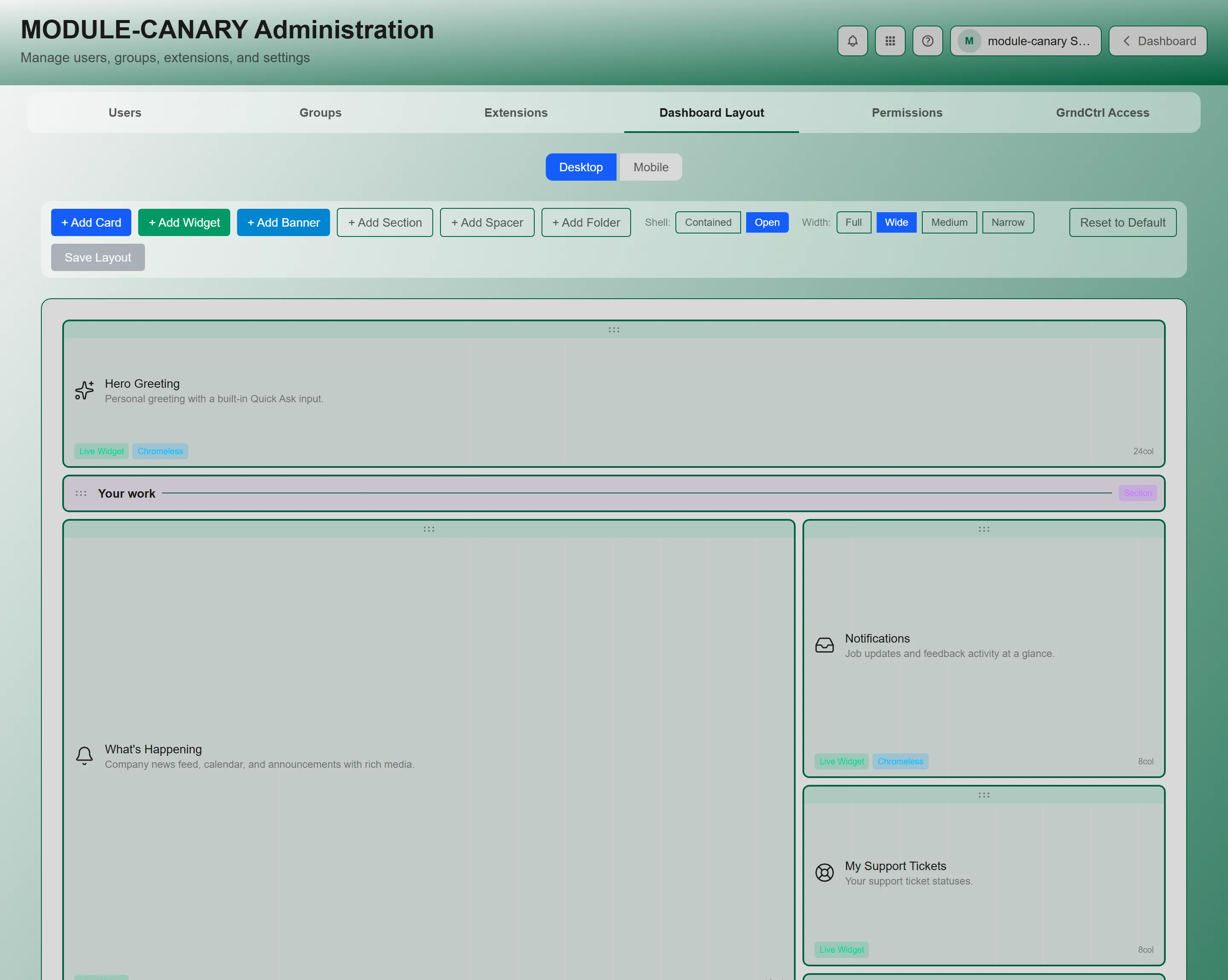
Desktop and Mobile Layouts
Section titled “Desktop and Mobile Layouts”The editor has two views: Desktop and Mobile. Each has its own grid layout — Desktop uses a 24-column grid, Mobile uses a 6-column grid. Switch between them with the toggle at the top. Changes to one layout do not affect the other, so you can optimize each for its screen size.
Editing the Layout
Section titled “Editing the Layout”- Drag cards to rearrange their position on the grid
- Resize cards by dragging the handle in the bottom-right corner
- + Add Card — adds a new card to the layout. Pick from available apps.
- + Add Folder — creates a collapsible group that other cards nest inside. You choose the folder’s name, so it can match how your organization actually thinks about its tools
Saving and Resetting
Section titled “Saving and Resetting”- Save Layout — saves the current arrangement for all users in the tenant
- Reset to Default — reverts to the system default layout
The footer shows a summary: total cards, folder count, layout type (Custom or Default), and who last edited it.
Permissions Tab
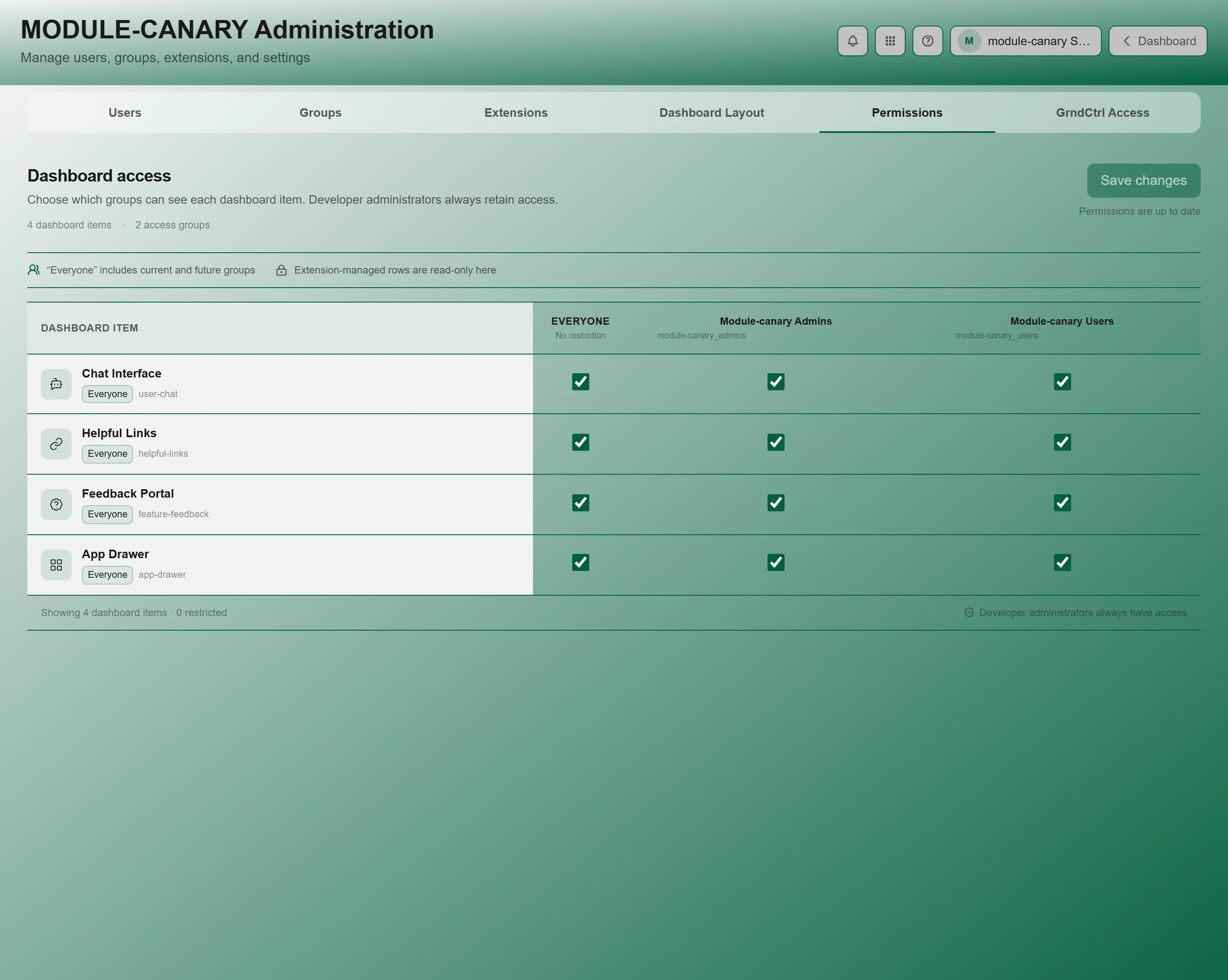
Section titled “Permissions Tab”The Permissions tab controls which groups can see which apps on the Home dashboard. Each app appears as a row, and each group appears as a column. Toggle permissions on or off per app/group combination.
Use this when you want certain teams to see specific cards — for example, showing the Quote Generator card only to the estimating group, or keeping Admin Chat off everyone else’s Home screen.
GrndCtrl Access Tab
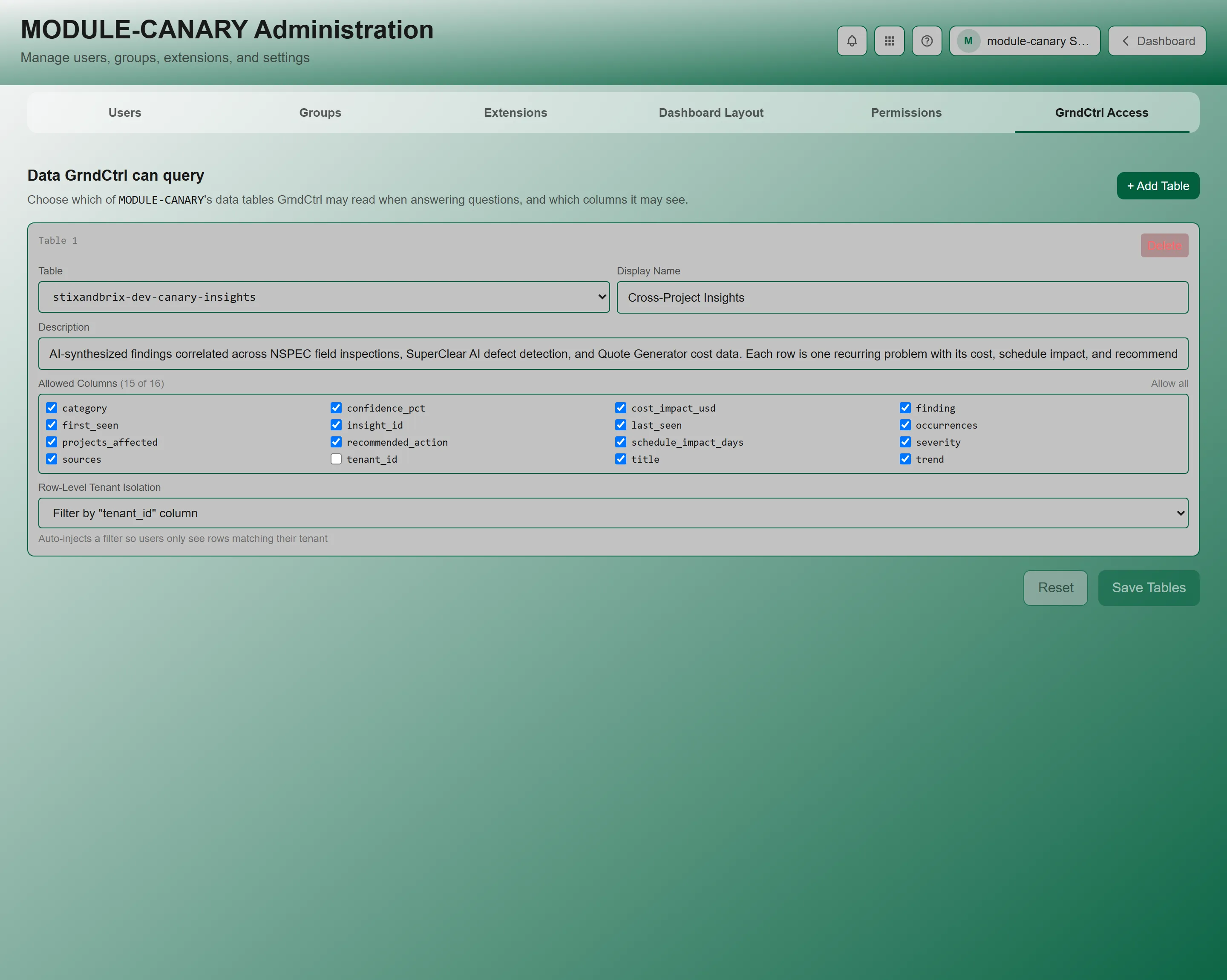
Section titled “GrndCtrl Access Tab”GrndCtrl Access decides what company data the AI assistant is allowed to read when it answers a question. The tab header states it plainly: “Data Brix can query” — choose which of your organization’s data tables Brix may read, and which columns it may see.
Adding a Table
Section titled “Adding a Table”- Click + Add Table. A numbered card appears — Table 1, Table 2, and so on.
- Pick the table from the Table dropdown. It lists the tables available to your organization, and a table already in use is removed from the list so you cannot add it twice. Selecting one fills in a suggested display name and isolation setting for you.
- Set a Display Name — the human name the assistant uses when it refers to this data (for example, Equipment Register).
- Add a Description. This is how the assistant knows when the table is relevant, so make it specific — for example, Owned and rented equipment, by site.
- Choose the Allowed Columns, then set Row-Level Tenant Isolation.
- Save your changes.
Allowed Columns
Section titled “Allowed Columns”Column control is how you keep sensitive fields away from the assistant while still letting it use the rest of the table.
- When GrndCtrl can read the table’s structure, you get a checkbox list of its columns with a running count — Allowed Columns (all), or (4 of 17) once you narrow it. Use Select specific to start choosing, and Allow all to go back.
- When the structure is not available, you get a comma-separated text box instead. The hint says it: blank = all.
Row-Level Tenant Isolation
Section titled “Row-Level Tenant Isolation”This setting keeps a shared table from leaking across organizations. It auto-injects a filter so users only see rows matching their own tenant. Three options:
| Option | When to use it |
|---|---|
| None (table is single-tenant or no isolation needed) | The table only ever holds your organization’s rows. |
| Filter by “tenant_id” column | The table has a tenant_id column identifying the owner of each row. |
| Filter by “pk” column (e.g., TENANT#id) | Ownership is encoded in the row’s primary key instead. |
Choosing a table from the dropdown pre-selects the isolation setting that matches how that table is actually organized, so the safe answer is usually already filled in. Change it only if you know the table’s structure.
Saving and Removing
Section titled “Saving and Removing”- Save when you are done. A confirmation reports how many tables were saved, and the tab records Last updated with the date and who made the change — useful when you need to answer “who gave the assistant access to this?”
- Delete on a table card removes it, after a Remove table? confirmation.
- A tenant with nothing configured shows No tables configured for this tenant. Click “+ Add Table” to get started.
Troubleshooting
Section titled “Troubleshooting”I can’t find Tenant Administration
Section titled “I can’t find Tenant Administration”Solutions:
- You need tenant administrator or developer administrator permissions. Contact your administrator.
- Your Home screen is arranged by your organization and may not have a card for it. Use the Apps button — the grid icon in the header — which lists everything you can reach.
A user signed in but doesn’t appear in the Approved list
Section titled “A user signed in but doesn’t appear in the Approved list”Solutions:
- Look for their row carrying the google_pending badge in the Access column — a first-time Google sign-in needs manual approval before it counts as provisioned
- If the user signs in through SSO, their identity provider or email domain has to be mapped to your organization. That mapping is managed by NXT — contact support if a whole domain is landing in the wrong place
Dashboard layout changes don’t appear for users
Section titled “Dashboard layout changes don’t appear for users”Solutions:
- Make sure you clicked Save Layout — dragging cards alone doesn’t persist
- Users may need to refresh their browser to see the updated layout