
Conversation Analytics
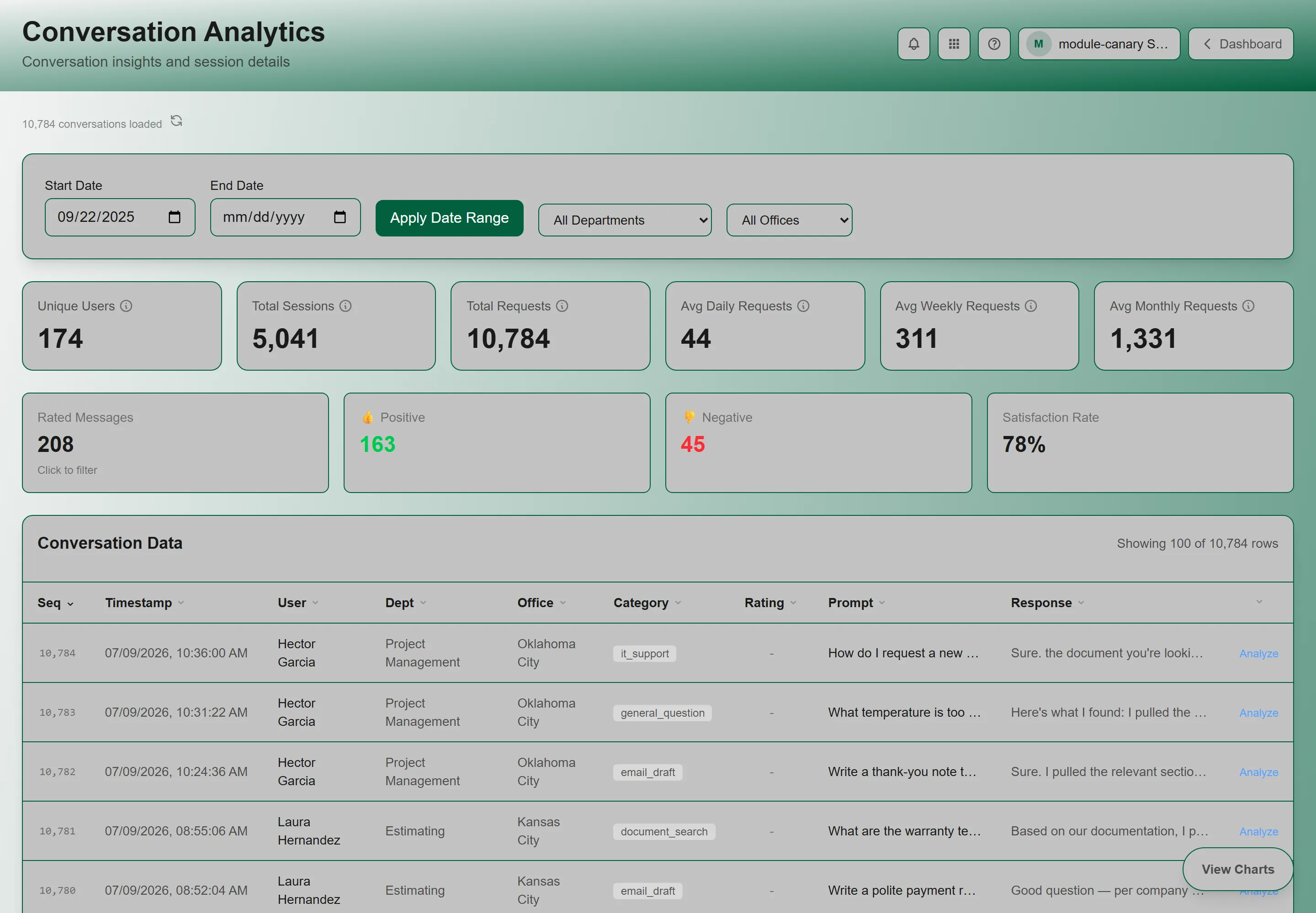
The Analytics dashboard gives tenant administrators a comprehensive view of how your organization uses the GrndCtrl AI chat. Track usage trends over time, see which offices and users are most active, analyze query categories, monitor feedback rates, and drill into individual conversations — all from one interactive dashboard.
Accessing Conversation Analytics
Section titled “Accessing Conversation Analytics”Click the Apps button — the grid icon in the header, available on every page — and choose Conversation Analytics. See Finding and Opening Your Apps if it is not listed there.
The dashboard loads with a progress overlay showing its loading stages.
Date Range Filters
Section titled “Date Range Filters”At the top of the dashboard, set the date range for the data:
- Start Date — defaults to the product launch date (September 2025)
- End Date — leave empty for “up to today” or pick a specific date
- Click Apply Date Range to reload the data
- Click the Refresh icon next to the conversation count to reload without changing dates
Summary Statistics
Section titled “Summary Statistics”Six KPI cards appear at the top:
| Card | What It Shows |
|---|---|
| Unique Users | Count of distinct users who chatted in the date range |
| Total Sessions | Number of conversation sessions started |
| Total Requests | Total user messages sent to the AI |
| Avg Daily Requests | Average messages per day |
| Avg Weekly Requests | Average messages per week |
| Avg Monthly Requests | Average messages per month |
Feedback Statistics
Section titled “Feedback Statistics”Below the usage KPIs, four feedback cards show response quality metrics:
| Card | What It Shows |
|---|---|
| Rated Messages | Total messages that received thumbs up or down (clickable — filters the table to only rated messages) |
| Positive Feedback (green) | Count of thumbs-up ratings |
| Negative Feedback (red) | Count of thumbs-down ratings |
| Satisfaction Rate | Percentage: positive / rated messages |
Interactive Charts
Section titled “Interactive Charts”Click View Charts to expand the charts section (click Hide Charts to collapse it). All charts are interactive — click any data point to cross-filter the conversation table below.
Activity Over Time
Section titled “Activity Over Time”A time series chart showing conversation volume. It supports three levels of drill-down:
- Monthly — click a month to drill into weekly view
- Weekly — click a week to drill into daily view
- Daily — the most granular level
A breadcrumb trail at the top shows your current drill level, and a Back button returns to the previous level.
Usage by Office
Section titled “Usage by Office”Horizontal bar chart showing requests per office and unique users per office. Click any bar to filter the table to that office.
Top Users
Section titled “Top Users”Horizontal bar chart showing the top 8 users by request count. Click a bar to filter the table to that user.
Usage by Hour of Day
Section titled “Usage by Hour of Day”Bar chart showing request volume for each hour (0–23). Click a bar to filter the table to messages sent during that hour.
Query Categories
Section titled “Query Categories”Pie chart showing the distribution of message classifications (query types). Click any slice to filter the table to that category.
Cross-Filtering
Section titled “Cross-Filtering”When you click a chart element, it acts as a filter. Active filters appear as blue chips above the table. You can:
- Click the X on any chip to remove that filter
- Click Clear all to reset all filters
- Stack multiple filters (e.g., filter by office AND hour)
Conversation Data Table
Section titled “Conversation Data Table”Below the charts, a sortable data table lists individual messages:
| Column | Description |
|---|---|
| Seq | Sequence number (chronological, oldest = 1) |
| Timestamp | Date and time of message |
| User | Who sent the message |
| Office | User’s office location |
| Category | Classification badge for the query type |
| Rating | Thumbs up, thumbs down, or dash (no rating) |
| Prompt | User’s message (truncated — hover for full text) |
| Response | AI’s response (truncated — hover for full text) |
Click any column header to sort. Click a row to open the Conversation Detail modal with the full message content.
Troubleshooting
Section titled “Troubleshooting”Dashboard shows no data
Section titled “Dashboard shows no data”Solutions:
- Expand the date range — the start date defaults to September 2025, but your data may be more recent
- Click Apply Date Range after changing dates
- Check that users in your tenant have been chatting with the AI
Dashboard loads slowly
Section titled “Dashboard loads slowly”Solutions:
- Large date ranges with thousands of messages take longer to process
- Narrow the date range to improve load times
- The progress overlay shows the current loading stage so you know it’s working